Pages

Sunday, September 25, 2011

Concept Artist Matthew Savage To Make A 'Darker And More Sinister' Feature Film

Concept artist Matthew Savage has done some incredible concept art for Doctor Who, The Dark Knight and other projects.

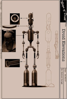
I thought I'd feature some work he did for the film he wrote and directed called Reign of Death(2009). It's short, but beautiful.

Synopsis: "In a 1930s vision of the future and gumshoe chases down a robotic murder suspect."


There was some talk about it becoming a feature film, but nothing since then. I think it would be awesome.

To see more of Matthew Savage's work, check out his site at http://www.mattsav.co.uk/.
[Image Source: Facebook]

Thursday, September 22, 2011

"Google is a godsend." Artist Syd Mead Tells NPR

Blade Runner "Curb Scene" Concept Art by Syd Mead
Syd Mead is a concept artist and designer for movies like Minority Report, Tron and Blade Runner. In an interview with NPR, the veteran artist describes his approach to producing futuristic concept art and the future of technology.

Describing himself as a "visual futurist" that starting with a script he develops his designs with the director and production designer. His greatest tool these days is the search engine "Google."

"Google is a godsend." Mead says, "You download different research tracts on that specific subject and find out that we're implanting cameras in people's eyes now,

"They're working on artificial nanoscale retinas. And so you start with that technology leap, or possibility, and then you design around that. To me, science fiction is reality ahead of schedule."

Talking about things as diverse as Iris scanners, like the ones in Minority Report he says "If something is a good idea, then it will probably come true, either because of economic pressures, or just simply invention. Technology tends to climb on its own past accomplishments. If you've solved three or four problems, you can probably solve eight more."

Its interesting to hear how he uses current technology to drive his art and create realism.

Overall, it's a good short article and well worth hearing from one of the premiere artists in the industry.

Head over to NPR to read the article and check out amazing work on Syd Mead's website http://sydmead.com.

What do you think? Can an artist predict the future using Google? 
 [Image Source: http://www.wired.com]

Wednesday, September 21, 2011

Watch Spider-Man Get Evicted in Sam Raimi 'Spider-Man 4' Storyboards

Spider-Man 4 probably would have been horrid based on Spider-Man 3 and the various ideas director Sam Raimi had in mind, but one thing's for sure. There would have been drama.

The film would have cast John Malkovich as the villain Vulture, and Anne Hathaway as Black Cat or the Vultress based on who you talked to.

Negotiations between the studio and Raimi broke down after they couldn't get a script in time to meet the release schedule. Supposedly Sam "hated" the script and wanted rewrites.

In the storyboards below, by Dave Lowrey, we see Peter Parker (Tobey McGuire) coming home to discover that the building he was renting has been condemned. All kinds of dramatic questions come to mind: Does this mean Peter's homeless? Will he have to move in with his Aunt May or Mary Jane? Seeing Peter on the curb is really moving.


Check out more of his work at http://davelowery.net/.

Do you think this would have been a good scene? What would Spider-Man do if he was homeless?

Tuesday, September 13, 2011

Top Ten Amazing Concept Art of 'X-Men: First Class' (2011)

There are many talented artists who worked on X-Men: First Class, and while I haven't seen all the artwork, these are my favorites.

Official plot synopsis: "X-Men: First Class charts the epic beginning of the X-Men saga, and reveals a secret history of famous global events. Before mutants had revealed themselves to the world, and before Charles Xavier and Erik Lensherr took the names Professor X and Magneto, they were two young men discovering their powers for the first time. Not archenemies, they were instead at first the closest of friends, working together with other Mutants (some familiar, some new), to stop Armageddon. In the process, a grave rift between them opened, which began the eternal war between Magneto’s Brotherhood and Professor X’s X-Men."


1. Angel by Howard Swindell

It's not hard to make the beautiful Zoe Kravitz look good, but the coy way Angel peeks behind her extended wings really sells this piece.

2. Beast by Howard Swindell

3. Beach wreckage by Jamie Rama

In the climactic battle at the end of the film, the mutants crash onto the beach. This landscape by Jamie Rama does a great job exploring the wreckage of the X-Men's jet.

3. Banshee scream by Steffen Reichstadt (Aaron Simms Company)
Banshee was an alright character in the film, but I think this concept art makes it really dynamic. Notice the change to his throat suggesting an incredible release of power.


UPDATE: See more of Steffen Reichstadt's X-Men work soon.

4. "Havok v.5" by Alex Mandra (Aaron Simms Company)

In the film Havok is able to release blasts of energy. I'm assuming this was a scene from when Havok was trapped on an aircraft carrier and he's blasting his way out.

5. "Havok v. 4" by Alex Mandra (Aaron Simms Company)
Another great scene of Havok blasting away. Notice a couple of things. First, he's not wearing his harness, but still has control of his power. Second, notice the sword which I'm assuming was owned by Azazel. That also might explain the leg and hoof hanging in the air.

6. Azazel by Jerad S. Merantz
This image of Azazel is much more extreme than what we saw on film. With the suggestion of horns and an amazing armored costume. I'm not sure about the fur coat though. Too much?

7. Angel by Jerad S. Merantz
Another alternate view of Angel, this one is far more goth than the final result. Some nice touches are the gorgeous backlit wings and the slight hint of drool at the corners of her mouth suggesting her acidic saliva.

 8. Darwin by Howard Swindell
A Photoshop job adds gills. This is the first art I've seen that shows Darwin's transformations effectively. He created a bunch more, but this is my favorite. 

9. "Emma Frost, Preliminary Design" by Hao Wu
The lovely view of Emma Frost as being made of large diamonds with sparkling eyes. The fire in high-quality diamonds really adds to the drama. In the film the effect is a bit muddied, so I like how this one shines.

10. "Havok Firing Sequence" by Hao Wu

While the final result looks nothing like this, I like how he laid out the feel of the sequence which is sweet. Great use of colors too.

Visit all the websites of the artists for more great stuff.
http://www.aaron-sims.com/
http://www.howardswindell.com/
http://www.haosketch.com/
http://jamierama.com/
http://jeradsmarantz.blogspot.com/
http://alexmandra.blogspot.com/

Some artwork taken from conceptartworld.com
What's your favorite concept art from the film? Do you have a favorite artist?


Saturday, September 10, 2011

'Back to the Future' Concept Art Let's You Wear the Amazing Nike Air McFlys of 2015 Today!

So, Nike released their first generation of the Nike Air Mags that were featured in the film Back to the Future II (1989) and, after reading an interview with Bob Gale, I went hunting for concept art.

Once you actually compare the final product with the designs, it kind of falls flat.

While the shoes are incredibly authentic reproductions of the movie shoes, it would have been nice if they'd designed them as Tinker had originally drawn, with accents and much bolder styling. Maybe next year. Still hyper-cool though.


The Nike "Air Mags," (or McFlys) named after the logo on the back, were originally supposed to be "Slamball Shoes." There was a scene were Marty plays a futuristic game of racquetball called Slamball, but it was cut because of the cost of building a huge racquetball court.

Sneaker News had a post on the eBay sale of the original prop Michael J. Fox wore in the film. That seller had a photocopy of the original design drawing by Nike's legendary shoe designer Tinker Hatfield (the designer of all of the Air Jordans).

Nike had some concept art as well, but it's not very clear.

Were these shoes supposed to have wheels? Maybe they could sue the "Heelies?"

Here we see Marty hanging upside down in his magnetic shoes.


The whole thing is for a great cause.

Nike announced that 1500 pairs of these shoes will be auctioned on eBay, nikemag.eBay.com, for a starting bid of $3,300 with all net proceeds going directly to the Michael J. Fox Foundation for Parkinson's Research. The auction ends on September 18 and 150 pairs will be posted on eBay per day for 10 days.

"We wanted to translate the excitement people have for the 'greatest shoe never made' and for the Back to the Future into positive action,” said Mark Parker, CEO of Nike. "But the long term objective is to raise awareness so the Foundation can achieve their goal of eradicating Parkinson’s disease."

Some of the illustrators on the original film were David Jonas and Martin A. Kline.

Would you wear a pair of these amazing shoes?

Thursday, September 8, 2011

'The Troll Hunters' Playful But Terrifying Concept Art

The concept art for a Norweigian mockmentary on trolls looks cute and cartoony until you see them in the film.

Synopsis: The government says there’s nothing to worry about – it’s just a problem with bears making trouble in the mountains and forests of Norway. But local hunters don’t believe it – and neither do a trio of college students who want to find out the truth. Armed with a video camera, they trail a mysterious “poacher,” who wants nothing to do with them. However, their persistence lands them straight in the path of the objects of his pursuits: trolls. They soon find themselves documenting every move of this grizzled, unlikely hero – the trollhunter – risking their lives to uncover the secrets of creatures only thought to exist in fairy tales

I've combined descriptions from thehollywoodnews and director André Øvredal's comments on Empire.

“I wanted it to be grounded in something Norwegian,” says Øvredal. “And the documentary style was to maximise the potential, because I realised that I can’t do a film like Jurassic Park in Norway. So the first thing I told the producer after I pitched the idea was, ‘We’re going to shoot it as a documentary.’ He immediately saw how that was going to work.”

The tone of the film treads somewhere between horror, comedy and adventure, landing somewhere in unmissable territory. “I didn’t want to make it a comedy, per se, and I didn’t want to make a horror movie where I would alienate the people who went there for an adventure film. I definitely intended it to have a fairy-tale quality.”


"Our artist, Håvard S. Johansen, was working for months on how the trolls were going to look. This is one where we were discussing how far from Norwegian troll mythology do we dare go? This was too far off, but it was fun to play around with."


The Jotnar (or Larde Jutne in Norwegian), though gigantic, is hunched, like an old man.
"This is the final troll in the movie, or the genesis of that. Again, with the trees on his back we were experimenting. This troll is hundreds of years old, so he’s a little stooped over, like an old man."


The ferocious Ringlefinch is missing an arm, apparently the result of some long-ago battle with another troll.
"This is the start of the troll that ended up under the bridge. It has a warrior look — muscular and bullish. The spikes are based on how the stone that is supposed to grow on his back behaves. But we decided it looked too extreme."

The three-headed Tosserlad’s heads are disturbingly grotesque – for the sole reason that the faces are based on those of truly deformed humans.
"I wanted this creature to be quite schizophrenic, in that it wants to go in three directions at once. This is one of the first sketches. It’s based on the drawings of Theodor Kittelsen and the guys who drew these things in the 18th century."


The Mountain Kings (or Dovre Gubbe in Norwegian) are based on the troll characters in Henrik Ibsen’s classic Norwegian play, “Peer Gynt”.
"This one looks like Cousin Itt from The Addams Family! This was the genesis for the trolls in the cave, which were overgrown. We had to develop a shape, then work on the nose, the fur and the facial expressions."


Now check out the terrifying trailer.


The official site is http://trollhunterfilm.com/

Check out more of the artist's work at http://havardjohansen.blogspot.com/ and read his commentary on the creation of the art. They said he took it too far!

Does this art make you scared of trolls?

Wednesday, September 7, 2011

The Single Image That Sold 'Cowboys and Aliens' (2011)

There's a great story in MTV that told how the film and graphic novel Cowboys and Aliens started with the single image of a cowboy shooting at a spaceship.

Alan Gasmer, an agent at WMA, relates how, while reviewing concept art in pitch meetings, they first recognized the potential of "Cowboys & Aliens."
"[Rosenberg would] flip over a poster, and then another and another. When he got to the third one, I said, what's that?
He said, it's 'Cowboys & Aliens.'
I said, that's your movie.
Even though he had nothing written down, I grabbed Rob [Carlson, another WMA agent], who pitched it to his client Steve Oedekerk [director of 'Ace Ventura: When Nature Calls,' and writer of 'The Nutty Professor']. Steve immediately said he was in, and that he would figure out the movie. We went out basically with an illustration and Steve, and we had five offers right away from Disney, Fox, Sony, Universal and DreamWorks until the latter two joined together and bought it. That's how business was done back then."

It is a pretty cool visual.


An alien takes out a cowboy on horseback.

Cowboy outfitted with alien weaponry.

Futuristic Indians

What do you think? Would you have bought onto this movie with just the images above?